Oct 19, 2026
Field notes: the week a slope mask killed the alignment everyone liked
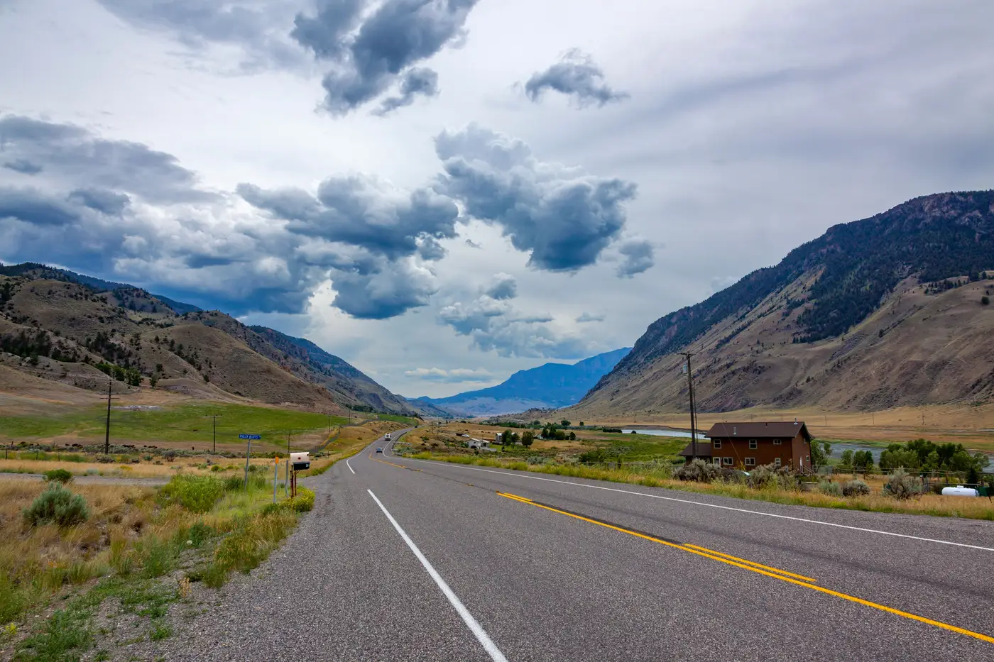
Alternative 2 had everything going for it. Shortest length, fewest residential takes, a clean tie-in to the existing interchange that didn't need a new structure. Three people on the team, independently, had circled it in the kickoff meeting before anyone had run a single number. That's usually a bad sign, in hindsight. When an alignment looks that good on a plan sheet, something is hiding in the contours.
We found it on a Wednesday, going through the slope mask for the third of three candidate corridors. Alternative 2 crossed a drainage shoulder we'd all clocked as "rolling terrain, nothing dramatic" from the topo. The mask told a different story: a three-hundred-meter stretch sat consistently above 15% cross slope, with a couple of short pockets pushing past 25%. That grade was enough to trigger retaining structure on one side for the full length, plus a drainage redesign where the natural flow path got cut at an angle the original grading didn't account for.
None of that shows up on a hillshade rendered at the zoom level most of us work at. You see the contour lines, you see they're a bit tighter than the surrounding area, and your eye reads "moderate grade, manageable." A proper slope classification catches what a glance at contour lines misses: that "a bit tighter" is doing a lot of work in that sentence.
The annoying part is that we'd already started pricing survey for Alternative 2. Two weeks of coordination with the field crew, flagging access points, lining up landowner permissions along a corridor that was, as it turned out, the wrong one to spend that effort on. Alternative 1, the one nobody loved at kickoff because it added four hundred meters and clipped the edge of a wetland boundary, had a slope profile that stayed under 10% for its entire length. Less exciting in a meeting. Cheaper to build, probably, once you price out the retaining wall and the redesigned culvert on the option everyone preferred.
This is the part of the job that doesn't get talked about much outside the office: the gap between what looks buildable from a topo sheet and what a slope mask confirms. Land cover tells you what's sitting on the ground. Built-up masks tell you what you'd have to buy or relocate. Slope tells you what the earthwork bill looks like before a single borehole goes in. Most teams run these as three separate exercises, usually in different software, at different points in the schedule, with the slope layer getting rushed because grading feels like a downstream problem. Grading is a screening problem, and it needs to happen before anyone commits survey budget to a corridor.
What would have saved us two weeks is seeing all three candidate alignments scored against land cover, slope and built-up constraints together, at project start, instead of discovering the slope problem on pass three of a manual overlay. That's the whole case for building the comparison before the favorites get picked in a meeting. A constraint-scored map of your candidate corridors, built before survey mobilizes, would have flagged that drainage shoulder on day one instead of day fourteen.
We ended up recommending Alternative 1 to the client, with a note explaining why the shorter option lost on constructability rather than preference. Nobody was thrilled, but nobody argued with the slope numbers either. That's the nice thing about a mask instead of a hunch: it doesn't care which alignment everyone liked in the kickoff meeting.
If you're staring down three candidate corridors and wondering which one is hiding a drainage shoulder of its own, that's exactly the gap Route Selection Map is built to close before you book the field crew.